 For the past few weeks we have been quietly testing some enhancements to the registration form. Co-Driver Pickers, while not glamorously named, let attendees indicate when they are sharing a vehicle with another participant so you, as the organizer know about it. Text Blocks, one of the form layout options, let you embed rich text including links and photos anywhere on the registration form for more descriptive text and endless merchandising opportunities.
You can find both of these under the wrench icons at the top of the Form Builder.
Co-Driver Picker
The Co-Driver Picker is all about forming teams. It could be a traditional team, like an endurance race where more than one racer will be driving a car, kart or riding a bike. The team members should be included in the timing and scoring data for MyLaps Orbits and displayed on entry lists. It could also be when two racers will be using the same vehicle in two different classes and the organizer wants to assign the same number for convenience. Or it could be an educational event like a high-performance driving school (HPDE) or Tire Rack Street Survival event where two students are sharing their street car but can't participate simultaneously (at least not comfortably!)
We refer to all of these cases as teams. Once the primary person has registered, the new Co-Driver Picker allows subsequent participants to join the team which is displayed in several sections of the EventMaster 360:
- Registration screen (in Assignments under "Co-Driver" column)
- Assignment reports have a new "Co-Driver" column available
- Attendee and Driver Experience detail reports
- Label generator
Participants can select their own teammates once a Co-Driver Picker is placed on the registration form and registrars can manually assign a teammate on the attendee screen.
Text Blocks
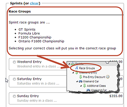
 Our core registration form components of Questions, Packages and Assigners each allow organizers to provide some help text which is displayed in a lighter color gray text under the related item on the registration form. Unlike these "hint" fields, the new Text Block is a full blown HTML editor (just like you're used to for Text & Waiver) so you can include links, images, bulleted lists, tables and more.

