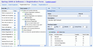
 On the drawing board for six months and in development for three, the next generation of our drag-and-drop registration form builder is about to go live this next week:
Because we eat our own dog food, we found numerous places to improve the editing process and create accelerators for tedious tasks. The first iteration of our form builder brought a whole new level of flexibility and control - letting organizers put anything anywhere with drag-and-drop, create dependencies and complex validation rules. Combined with new capabilities like order form branching, all of that is wrapped into a slick user interface that works on Firefox, Internet Explorer, Safari, Chrome and Opera on all major platforms. And just for fun, we made it about 3x faster too!
Looking back at my development notes, it's inspiring to see the progression of a user-centered design process like we use here. It starts with rough sketches on scrap paper, to pen-and-ruler designs on grid paper, to a short specifications document and feature description to early betas and finally the finished product. At each step along the way we incorporate user review, feedback and usability studies to determine how effective each change is going to be.
Stay tuned, we'll be posting a short screencast to demonstrate some of the new features that make us giggle like schoolgirls.
